Web Design is so much easier with a smart LOGO, How to get it Right?
![]()
Have you just started out your business, and looking to launch it online with a great website? Well, the LOGO is the first thing you need in web design. Then comes the design and development part. Once the logo is done, the whole web design revolves around it, and is so much simpler. Getting the logo right can be fiendishly difficult, and that’s why you should check these 3 iconic brand logos, and how they stood the test of time.
The Apple Logo

The Apple logo is a simple no nonsense one, with a direct link to the name & the bite in it makes you curious. Some say it represents the “byte”. Well, I’d say the most important function of the “bite” would be – Scalability. That’s one of the most important factors to consider in modern Web Design. The Apple logo when shrunk looked like a cherry, but, adding the bite to it, made sure it still looked like an Apple.
It is also one example, where the logo doesn’t need to represent the product in any way. Eg: The dominos logo doesn’t need to be a pizza. The logo pioneer Paul once said: “distinctive, memorable and clear” is what’s important.
The Cadbury Logo
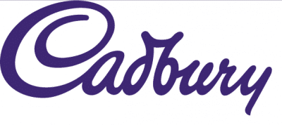
The Cadbury logo is one good example of how you can ‘own’ a colour through your logo. Or how you can colour brand yourself and and your website. Owning a colour also makes it tremendously easy to produce great web design examples.
The unique font or personalised writing style like in the logo Cadbury, inclusive feel to a brand. Works best for brands which are used daily. Like Consumer Goods.
The Nike Logo

The Nike logo is perhaps the most recognisable brand logos in the world. The irony in the history behind it is that, it was made by a student Carolyn Davidson against tight deadlines. She was paid $35 for it. Out of the multiple options he was given to choose from, the company’s co-founder Phil Knight chose the “swoosh” and said: It doesn’t look catchy or attractive, but, it will grow on me”. And, it conveyed motion, like he wanted.
Like a good song, a good logo doesn’t need to be flashy or eye catchy at the first encounter. When designing or choosing logos, be calm, take a step back and consider all possible aspects of it. Like how it will fulfil the brief, how it will be portrayed across a range of uses, how it grows on you etc.. instead of the initial “wow” factor, which might wear off fast.
Work hard, and your web design efforts will turn out to be a great website!
Note: If you need professional help in creating, branding and marketing your business website, you can contact us. We are a professional & 100% Australian web design & development company in Sydney: www.elegantwebservices.com.au
Founded in 2015, Elegant Web Services is a full-service Internet Marketing, Web Design agency based in Sydney, creating winning solutions for businesses and professionals who want to build or improve their presence online.